What information does the Summary tab report?
The Summary dashboard provides interactive visualizations that can help generate high-level insights through a summary view of the loyalty program, member performance, and transaction and spend data from the overall member base. It provides detailed information on the merchant’s member base, with charts providing deeper insight into tier composition and member purchase recency. There are charts showing spend averages and transaction totals, channel breakdown, and payment type breakdown. Tying transaction-based reports to membership data allows SessionM to track revenue generated from different membership tiers and other powerful metrics.
For information on the actions you can perform on the visualizations and key performance indicators (KPIs), see Common operations.
Filtering in the Summary tab
The Incentives tab within the Insights dashboard has the ability to filter by date ranges. Simply click anywhere on the "Controls" bar to expand it. Filtering controls are available at the top of the tab, as shown below:

Expand all of the controls by clicking on any one of them or by clicking the arrow on the far right.
The controls enhance your ability to focus on particular areas of interest.
-
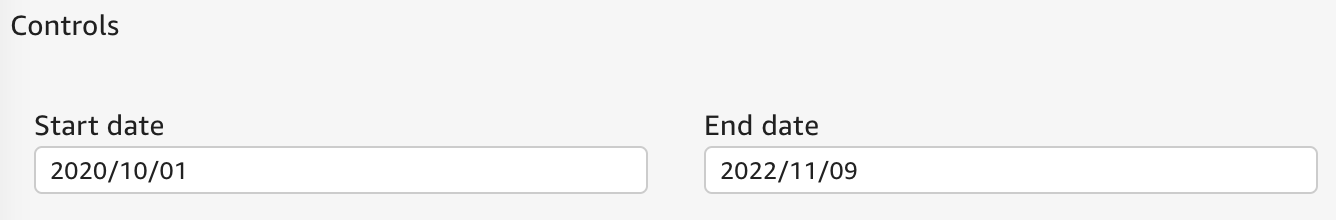
Start date and End date are date pickers that allow you to select the range of dates within which the displayed data is aggregated. Indicators are updated to aggregate data for only the selected period, while charts have their date ranges adapted to the selection. By default, it shows data for the past two years.
Membership over time
This graphic displays the platform members over time. A member profile in the SessionM Platform is defined as a distinct user ID that is part of an active loyalty program.
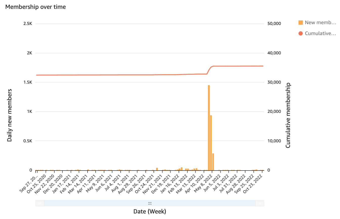
The x-axis depicts time in days, and the two y-axes provide the following information:
-
The left y-axis corresponds to the bar graph and represents the number of members added during a specific day.
-
The right y-axis corresponds to the line graph and shows the cumulative count of members over time.
The daily count will add to cumulative count up to that point in time.
Use this visual to identify both growth rate over time and any spikes in customers added. It gives you an idea of the health of a platform or loyalty program. Patterns can form and demonstrate peaks and valleys of member onboarding. This graph is helpful to compare with other breakdowns, such as total sales over time.
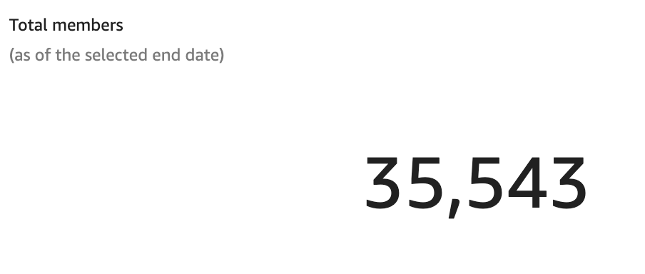
Total members and Average daily new members
The Total members indicator (shown below) is a KPI displaying member profile count at the time of last refresh. This indicator is affected only by the selected end date in the date range controls.
Average daily new members shows an average across the selected date range, with both start date and end date included in the count. This metric helps you to understand member acquisition over time, while allowing both a narrow or broad view.
Purchase recency by current tier
These KPIs show the total number of members who made a purchase within certain pre-defined date ranges, for example, 1-30 days or 31-60 days. Members are divided by their current tier, that is, each member appears in the row corresponding to the tier they are currently part of, which is not necessarily the bucket in which they made their last purchase.
A key benefit of this chart is that it provides the current number of member in each tier.
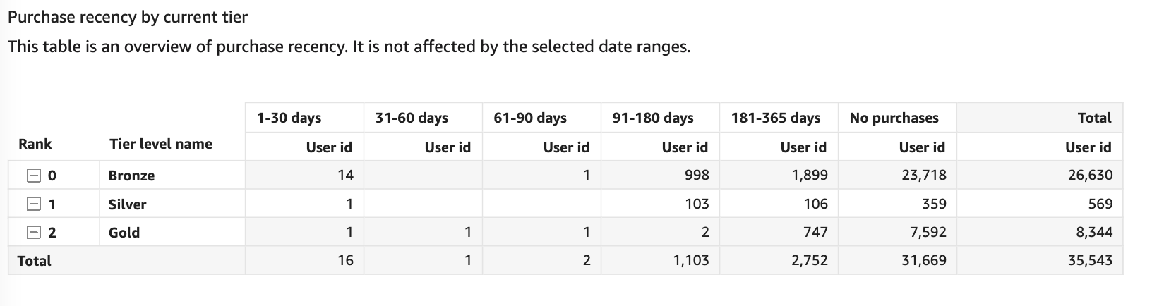
The chart provides the ability to see how many exact members are making purchases how frequently. These KPIs can help build targets around increasing purchase frequency among specific members.
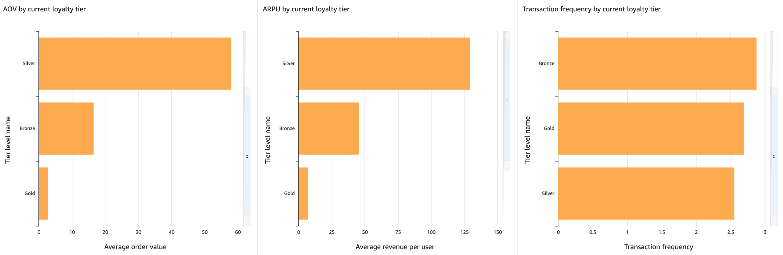
Average order value, Average revenue per user and transaction frequency - by current loyalty tier
These visuals demonstrate a 12-month review of KPIs of interest for member purchase behaviors including Average Revenue Per User (ARPU), Average Order Value (AOV), and Transaction frequency.
-
AOV: Horizontal bar chart that demonstrates the AOV in a 12-month period broken down by tier levels. AOV is defined as the sum of revenue divided by the distinct count of unique transactions within the 12-month window.
-
ARPU: Horizontal bar chart that demonstrates the ARPU in a 12-month period broken down by tier levels. ARPU is defined as the sum of revenue divided by the distinct count of unique purchasers (buyers) within the 12-month window. This effectively means the member base being looked at here is active purchasers.
-
Transaction frequency: Horizontal bar chart that demonstrates the transaction frequency in a 12-month period broken down by tier levels. Transaction frequency is defined as the count of all transactions divided by the unique purchasers in that 12-month period. The average transactions here is a proxy for member purchase cadence.
Sales, transaction count, purchasing members over time
This combined bar and line graph shows overall sales totals and purchasing activity for members. One of the bars provides a total count of transactions generated by members and non-members, while the second bar presents a count of members that have generated transactions over time. The line graph focuses on the total sales generated by members and non-members.
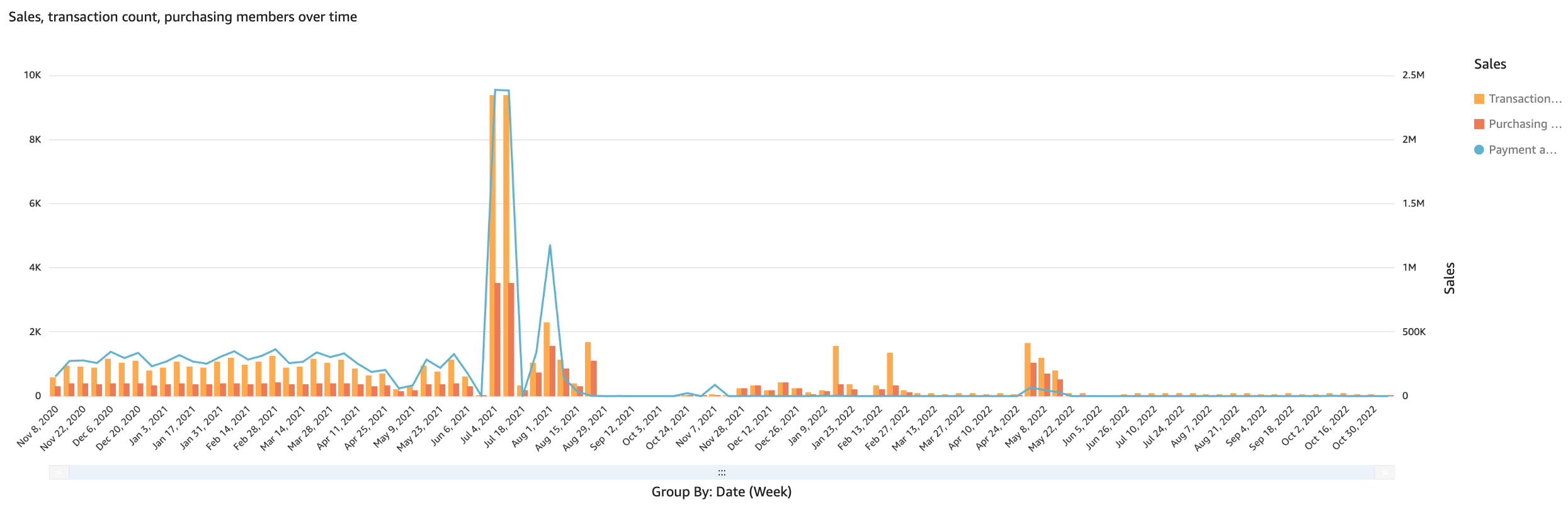
The chart provides a general overview of sales, as a support for the breakdowns shown further below in the dashboard. Tracking the number of transacting members can also support in identifying gaps or opportunities in maintaining a healthy loyalty program and incentivizing greater spend amount.
Sales by payment type
This bar graph shows sales totals broken down by payment type. The stacked groups represent different payment types used in the members’ transactions. Payment type is not validated and can be a string the POS provides to SessionM.
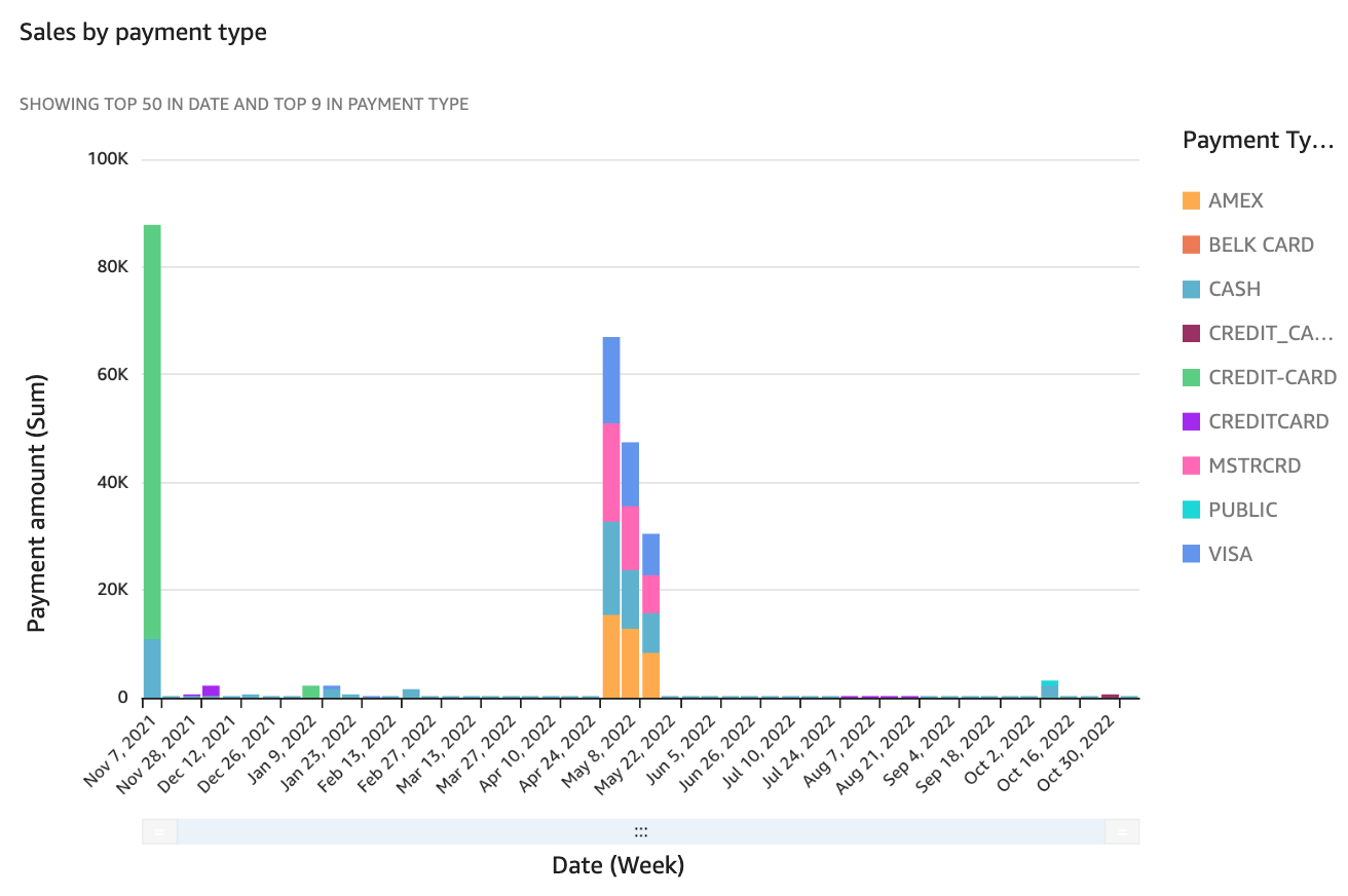
The chart provides the ability to track payment type breakdown, revealing insight into the company’s member base. This breakdown helps the company track and partner with various payment service providers to incentivize greater sales and also analyze how payment types correlate to different sales channels.
Sales by payment channel
This bar graph shows sales totals broken down by Sales Channel (Store, Online, Mobile, etc). The stacked groups represent different channels used for users’ purchases.
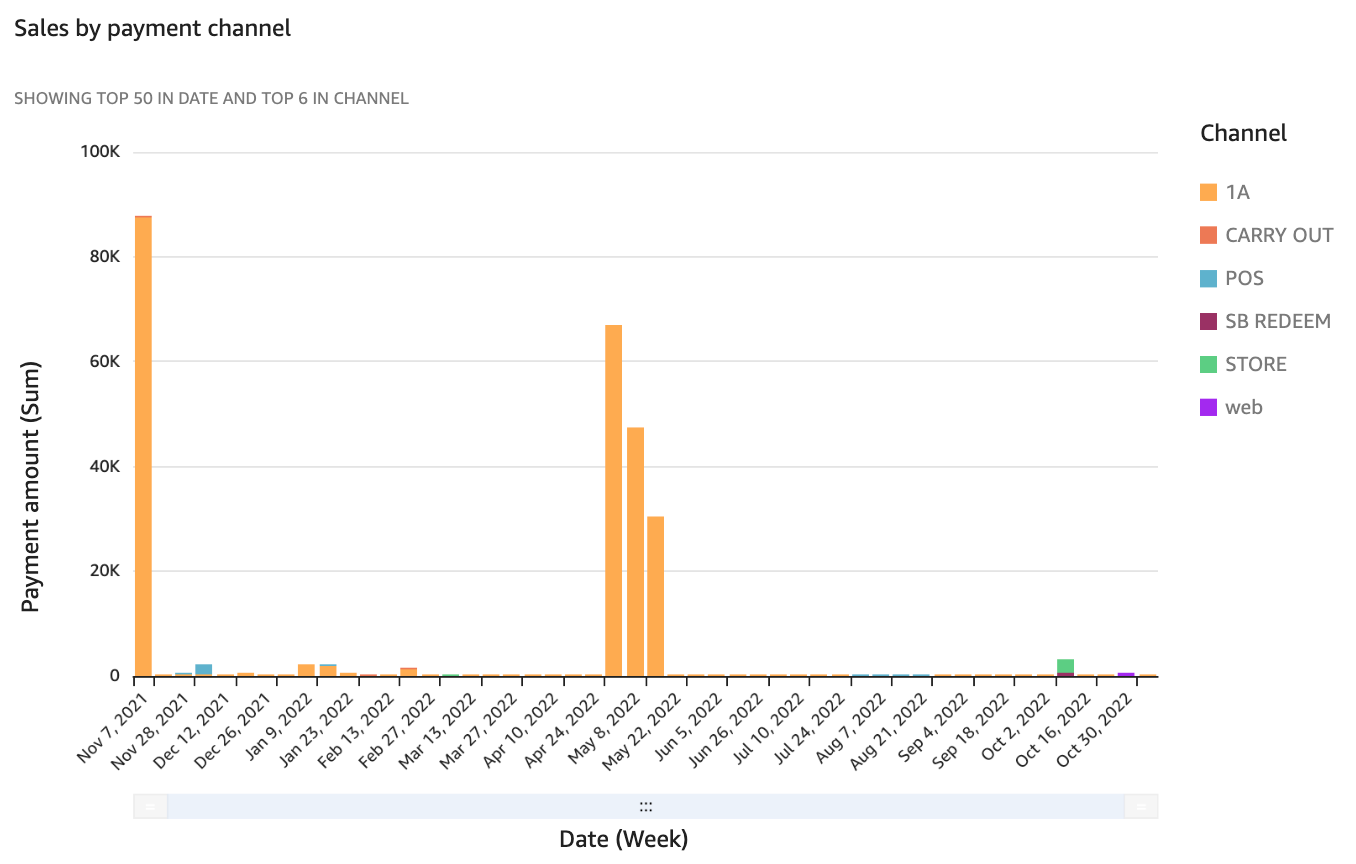
The chart provides the ability to track sales by channel, revealing insight into the company’s member base. This breakdown helps the company build offer programs targeting specific channels and also shows the omni-channel health for the company. In summary, being able to visualize the more popular channels for sales allows marketers to identify spending habits for their programs.
Sales by current loyalty tier
This graph displays bars that reflect total sales by tier level composition for all loyalty members over time. The number of groups depends on the number of loyalty tiers being utilized in the loyalty program.
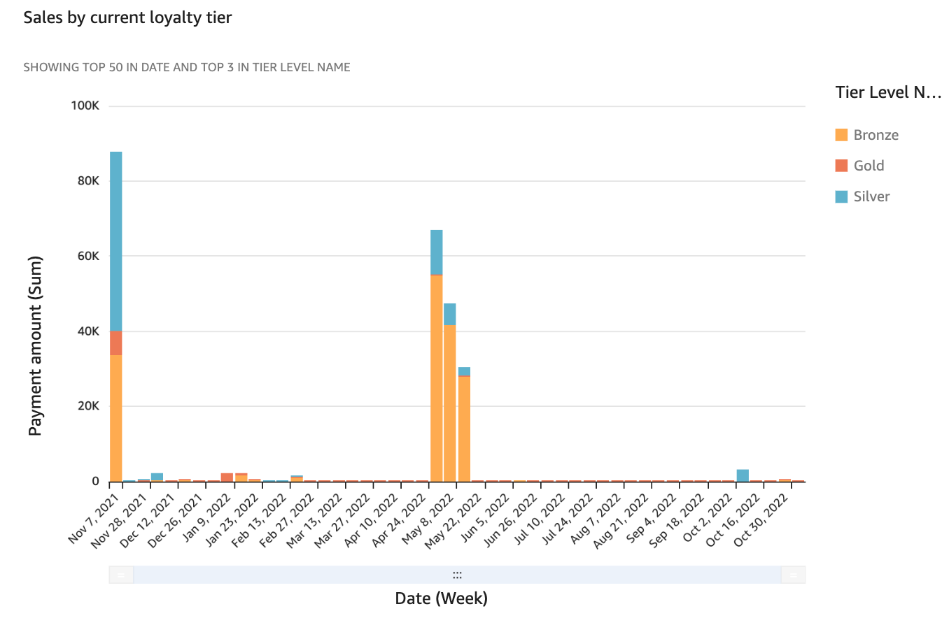
The chart provides the ability to track overall sales with additional insight into how much each tier level’s members are spending. This helps show how current tier programs are doing and if the tier-level spend is well distributed. Looking at this chart in parallel with tier composition information shows relevant information about the loyalty program’s impact on overall sales.
Top locations by sales and transaction count
This chart offers an overview of sales performance by store location. Each location is identified by its store id and store name. The indicators are:
-
Transaction count: total number of transactions that have occurred within the selected time period
-
Payment amount: total sales for the selected time period
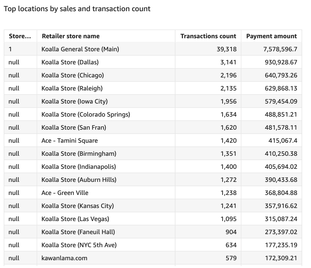
Note that the column can be sorted by ascending or descending order by clicking on the relevant column title and selecting the sorting option.
This table helps you closely track the performance of store across different regions and support decisions around which segments to focus on for better engagement.