About Customers 2 settings
The Customers 2 Settings page provides organizations with the ability to configure a variety of UI components that display on the SessionM Platform.
Getting to know the Customers 2 Settings page
Review this section for a general introduction to the Customers 2 Settings page.
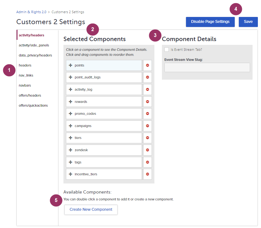
Consult the numbered sections below for the account details presented on this page:
1 - UI Component Locations
The names shown in this navigation column correspond to locations in the platform UI that contain components and sub-components that can be configured. For example, the activity/headers component location refers to the sub-tabs, or headers, of the Activity tab in the Customers Module. When you click a location, the items shown in the Selected Components table change to reflect the components (often sub-components) that correspond with the active component.2 - Selected Components
The components shown in this table are associated with the location active in the navigation column of the page. When you click on a component, its corresponding details display in the Component Details area of the page. In addition, components can be clicked and dragged to new positions in the sequence, and they can be removed by clicking the red icon to their right.3 - Component Details
The attributes shown in this area related to the component you click in the Selected Components table. The details presented does vary. For example, the details shown for activity/headers components configure event streams because each of the activity/headers components displays activity log data, such as the points for a particular user.4 - Disable Page Settings and Save Buttons
The Disable Page Settings button suspends the access to and application of all Customers 2 Settings configured for the Customers Module. When clicked, the system reverts to a default configuration and the Enable Page Settings button displays. The Save button applies the configured settings to the Customers Module.5 - Available Components
The components shown here are available for inclusion in the Selected Components table, and, as such, in the presentation of tabs within a specific part of the Customers Module. Double-click a component to include it. If you want to add a new component, click the Create New Component button.
How settings correlate to components
This section details the correlations between settings configured in the Customers 2 Settings page and the actual appearance of the UI components in the Customers Module.
The following components can be customized:
- Activity tab's sub-tabs (activity/headers)
- Activity tab's Activity Log sub-tab side panels (activity/side_panels)
- Data Privacy tab's sub-tabs (data_privacy/headers)
- Customer profile summary data for active customer (headers)
- Navigation links (nav_links)
- Navigation bar containing main tabs (navbars)
- Offers tab's sub-tabs (offers/headers)
- Offers tab's quick actions (offers/quickactions)
Many of the components in this list are specified by tab and sub-tab. Therefore component names can contain a slash to make that distinction. Note that the appearance of these components is subject to default system formatting that can be modified. For more information, consult your SessionM client services team.
Activity headers
The Activity tab contains an array of sub-tabs on the details page that display activity log information for customer transactions across loyalty programs, point economies, and campaigns.
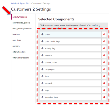
The activity/headers components and their sequence are shown below:
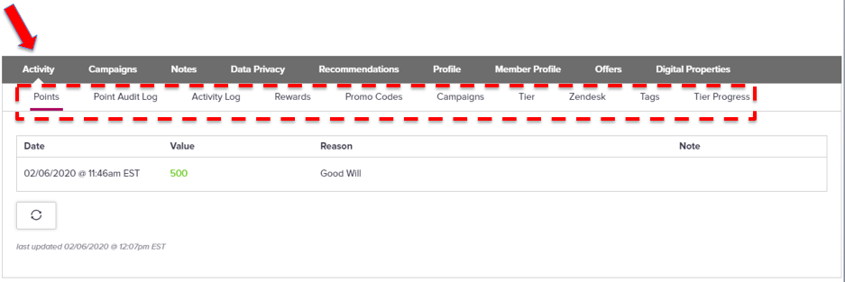
This component configuration generates the following display in the Customers Module:
Activity log side panels
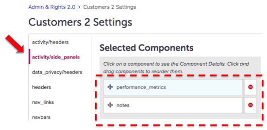
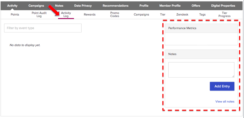
The Activity tab's Activity Log sub-tab on the details page contains side panels for performance metrics and notes associated with the active customer.
The activity/side_panels components and their sequence are shown below:
This component configuration generates the following display in the Customers Module:
Data privacy headers
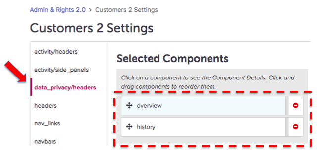
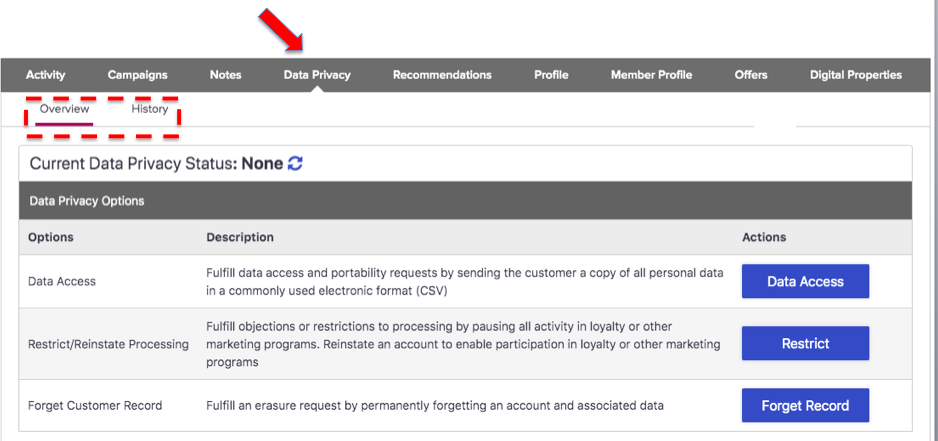
The Data Privacy tab on the details page contains an Overview sub-tab for performing data privacy actions and a History sub-tab detailing the actions taken with respect to the active customer.
The data_privacy/headers components and their sequence are shown below:
This component configuration generates the following display in the Customers Module:
Headers
The summary row of data near the top of the details page contains profile data for the active customer.
The headers components and their sequence are shown below:
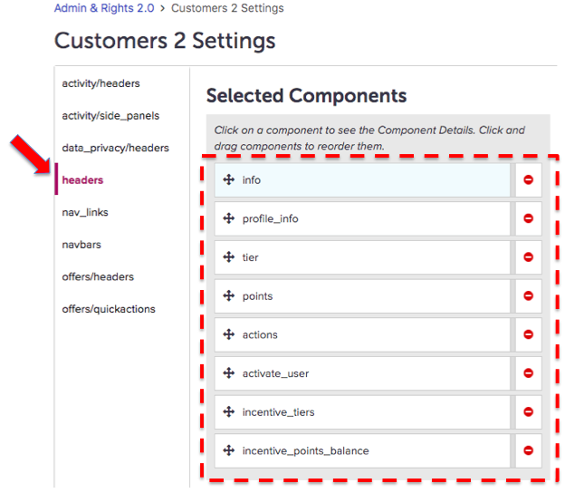
This component configuration generates the following display in the Customers Module:

Navigation links
The navigation links at the top of all pages in the module support adding customers, searching customers, and synching a customer's account.
The nav_links components and their sequence are shown below:
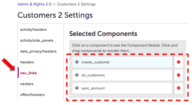
This component configuration generates the following display in the Customers Module:

Navigation bars
The primary navigation bar contains the major tabs of the Customers Module.
The navbars components and their sequence are shown below:
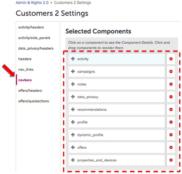
This component configuration generates the following display in the Customers Module:

Offers headers
The Offers tab contains an array of sub-tabs on the details page that display customer transactions associated with offers.
The offers/headers components and their sequence are shown below:
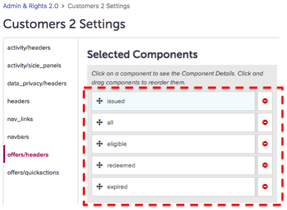
This component configuration generates the following display in the Customers Module:

Offers quick actions
The actions associated with offers available on the sub-tabs of the Offers tab.
The offers/quickactions components and their sequence are shown below:
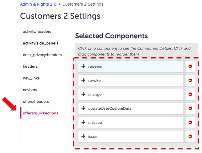
This component configuration generates the options that display when the user clicks the quick options button at the far right of a table row for the active sub-tab. Those that display can differ per sub-tab. For example, the following image depicts the quick actions available on the Issued tab:
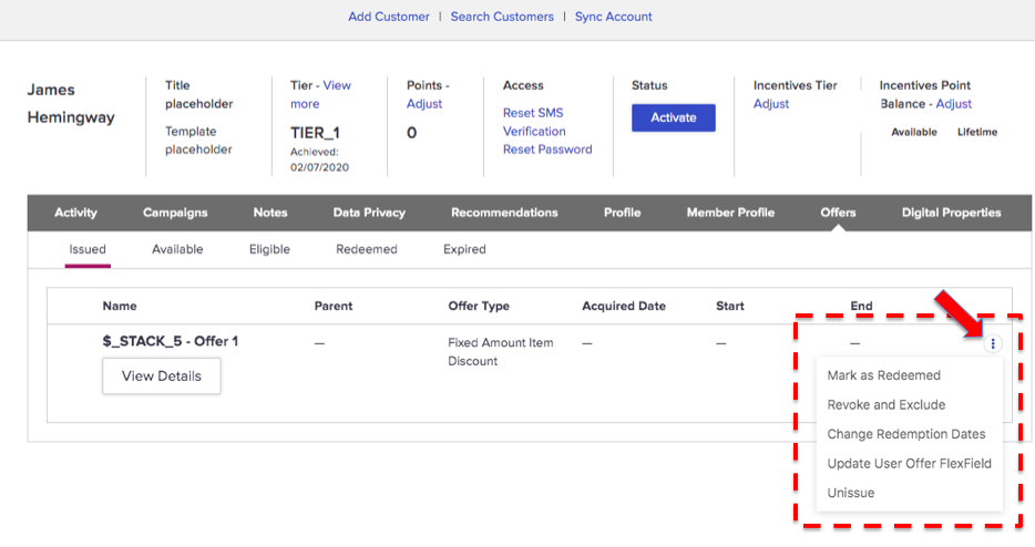
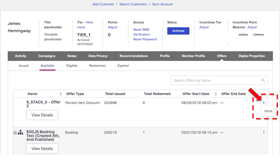
Alternatively, the Available sub-tab contains the quick action shown below:
